
Background
Cart and checkout are where an e-commerce experience either earns or loses the sale. HP was seeing a higher-than-acceptable exit rate during checkout: too many users who had already added items and begun the purchase process were abandoning before completing it. The signals pointed clearly to friction linked to the length and cognitive load of the flow. Users were encountering too many decisions, too much information, and not enough clarity about where they were in the process and what was still ahead of them.
As part of a broader effort to align and evolve the HP Store globally, we initiated a full redesign of the cart and checkout experience. I led the project as UX Lead alongside a team of two designers and a researcher, responsible for stakeholder communication, research planning, and the UX and UI design work across the six months from kick-off to deployment.
The process
The project followed a double-diamond structure: two phases of divergent and convergent work, the first focused on understanding the problem fully before defining the design direction, the second on developing and validating a solution before delivering it.
Discover
We approached the existing experience from multiple angles simultaneously. A heuristic analysis gave us an expert-level read of the friction points before any user research. Researcher-led task sessions with real users put those hypotheses to the test: participants completed purchase tasks while narrating their thought process, making the moments of confusion and hesitation visible. We also ran stakeholder interviews across business units to surface internal knowledge that rarely made it into product discussions, and reviewed quantitative metrics to understand where in the funnel users were dropping and at what rate.
What came back reinforced the initial hypothesis. The checkout flow was long, and it felt longer than it was. Users had no reliable sense of progress through it. Several steps presented information or decisions that users either did not understand or did not feel equipped to make quickly, and the instinct was to leave rather than push through.
Define
With the problem understood, we set measurable goals: specific metrics that would define success and allow the A/B test to produce a clear verdict. We also mapped every use case across HP's global stores, a necessary step for a product operating across regions with different payment methods, tax structures, promotional mechanics, and product catalogues. The global scope added complexity to every design decision; solutions that worked cleanly for one region often created edge cases in another. Benchmarking against how other e-commerce experiences handled comparable problems gave us a starting point for the development phase.
Develop
The design work centred on reducing cognitive load without reducing the information users needed to make confident decisions. We worked through flows and wireframes before moving to higher fidelity, running concept validation checkpoints against user goals, business constraints, and technical feasibility to avoid investing in directions that would not survive implementation.
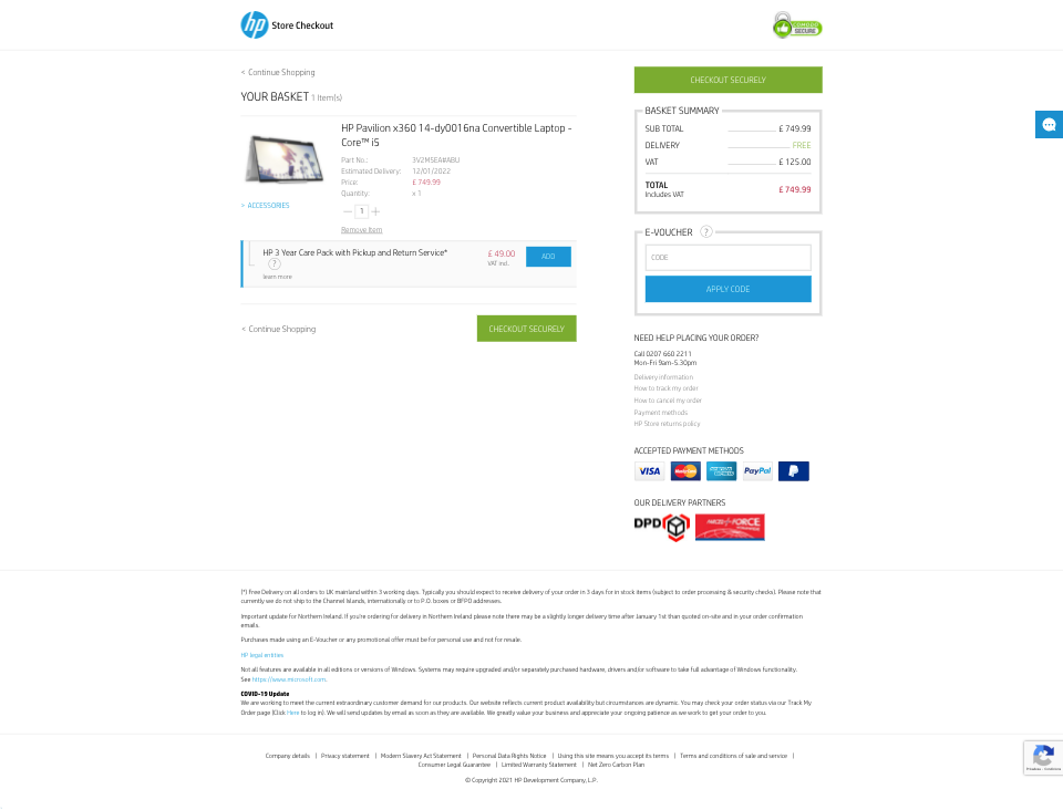
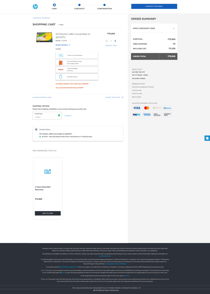
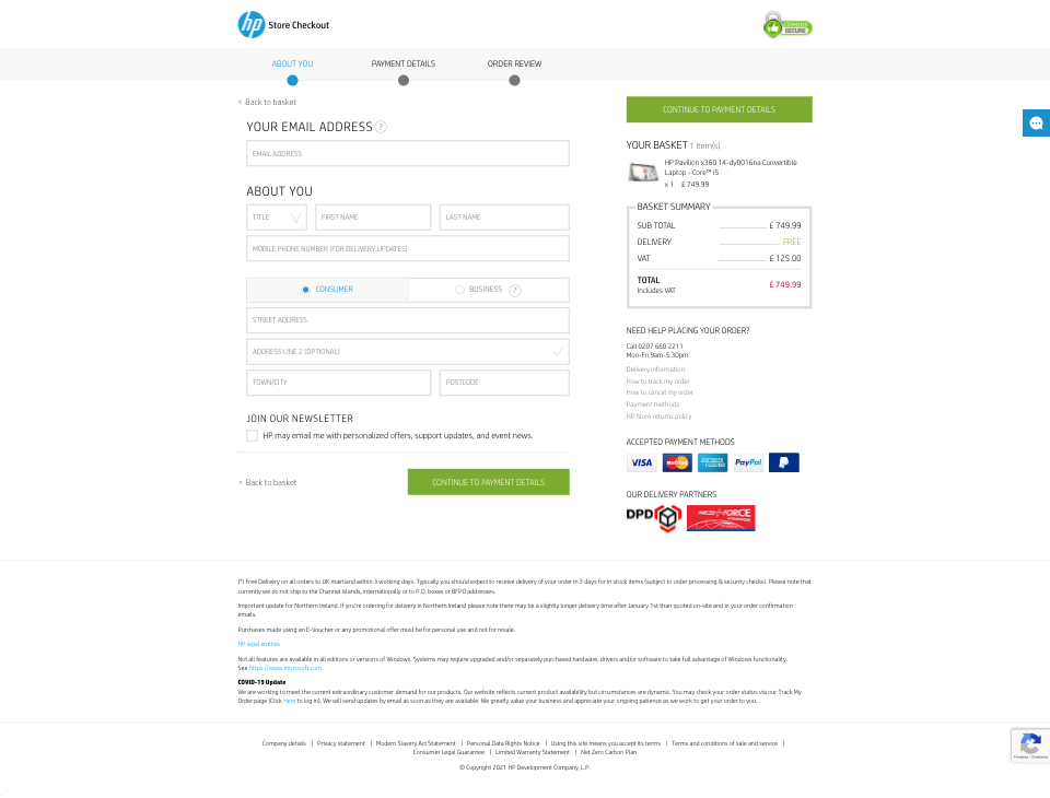
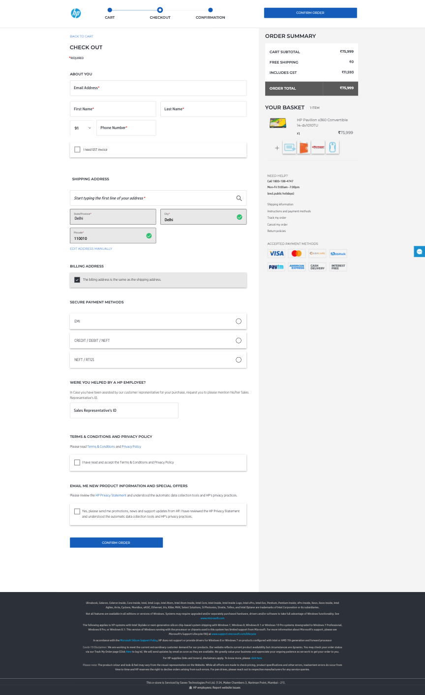
The specific changes that made it into the final design were each a response to something we had observed. A visible process indicator addressed the lack of progress feedback directly. Collapsible sections reduced the amount of information on screen at any one time without removing it. Detailed product information at the cart stage gave users the validation they needed before committing to checkout. Cross-sell opportunities were introduced in a way that did not interrupt the purchase flow.
Deliver
The finalised design was fully documented and handed to the development team, with active support through implementation: clarifying design intent as questions arose, and running QA against the built product before sign-off. The experience launched as an A/B test against the existing checkout across a subset of HP's global stores.
Before and after
Outcome
After four weeks, the A/B test results were reviewed against the success metrics defined during discovery. The results supported a full rollout, and the new experience began replacing the old one progressively across regions, starting with Asia and LATAM.
Post-launch analysis continued after rollout, identifying further improvement opportunities that fed into a follow-on action plan including qualitative testing and targeted A/B tests on specific elements of the flow.
Outcome
A redesigned purchase experience, validated through A/B testing, rolled out progressively across HP's global stores. The changes addressed the specific friction points identified in discovery: clearer progress feedback, reduced cognitive load per step, and better information architecture through the cart and checkout flow.